
Just when I had made Spectrum Colors Arranged in Order, after Ellsworth Kelly, I notice that MOMA has updated the picture they use of the work on their website, with markedly brighter colors. This was something I had been experimenting with to better reflect the impact the colors would have made in the time that Kelly selected and used them. Now MOMA seems to have realized the picture they used was perhaps a bit too subdued to do the work honor.
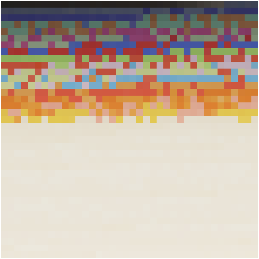
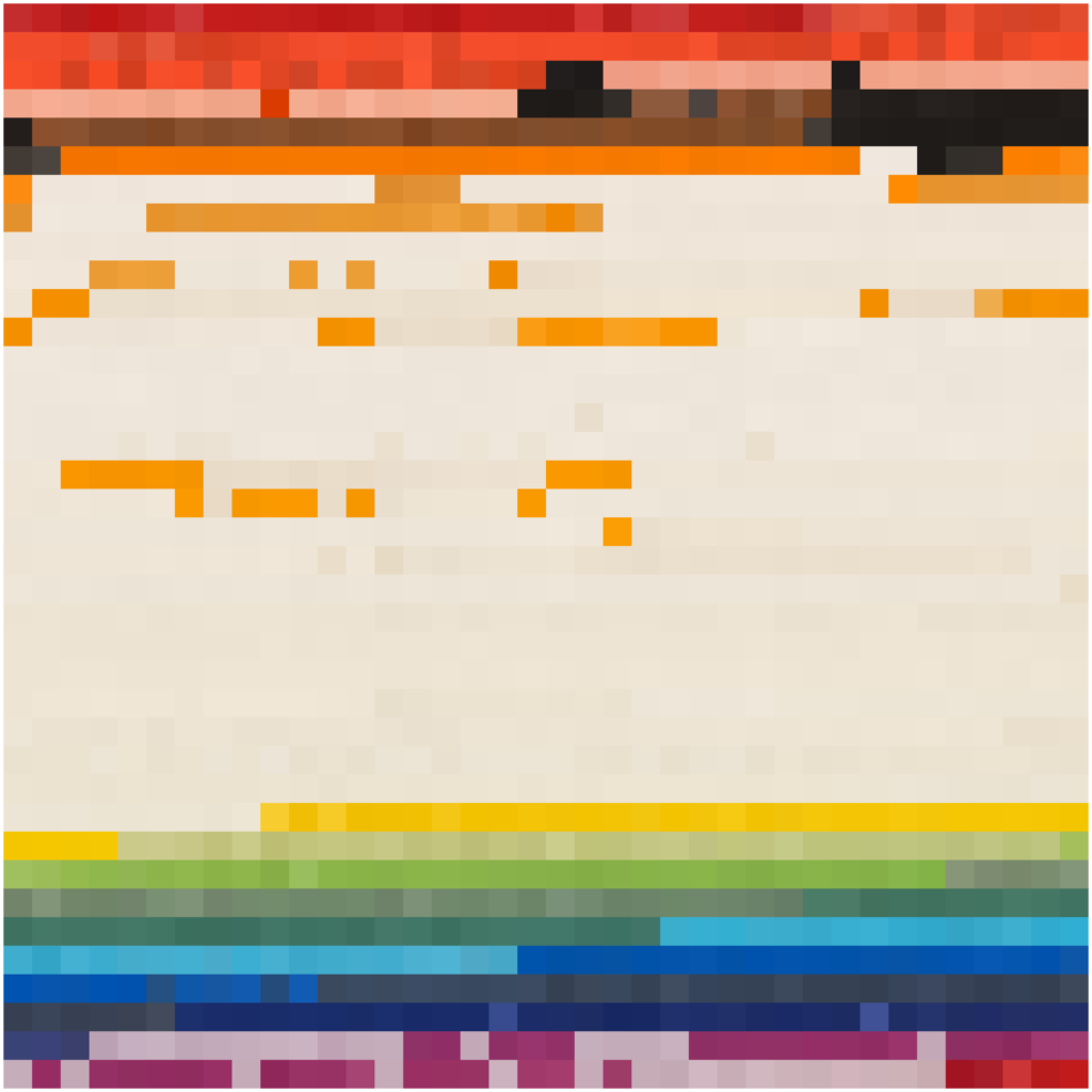
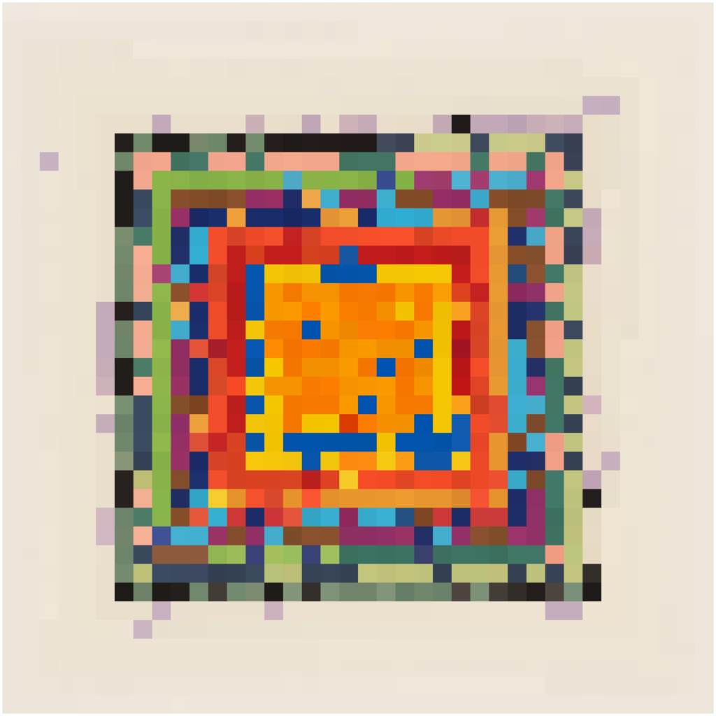
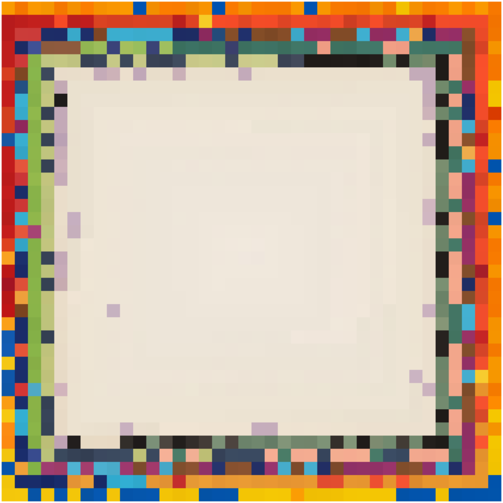
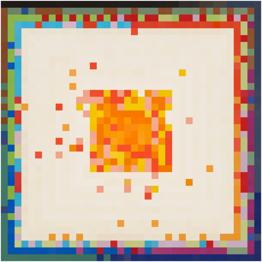
Below are two pictures that I generated by reading the RGB values from the MOMA picture and drawing the squares with computer in the original order (instead of random). This clearly shows how much more bright the new colors are. What I think happened is that in 2021 a print-ready picture, with CMYK / Print optimization and maybe profile , was used to produce the web RGB version. The new version is optimized for RGB and maybe has a specific profile attached.
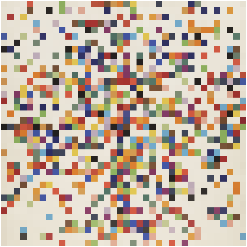
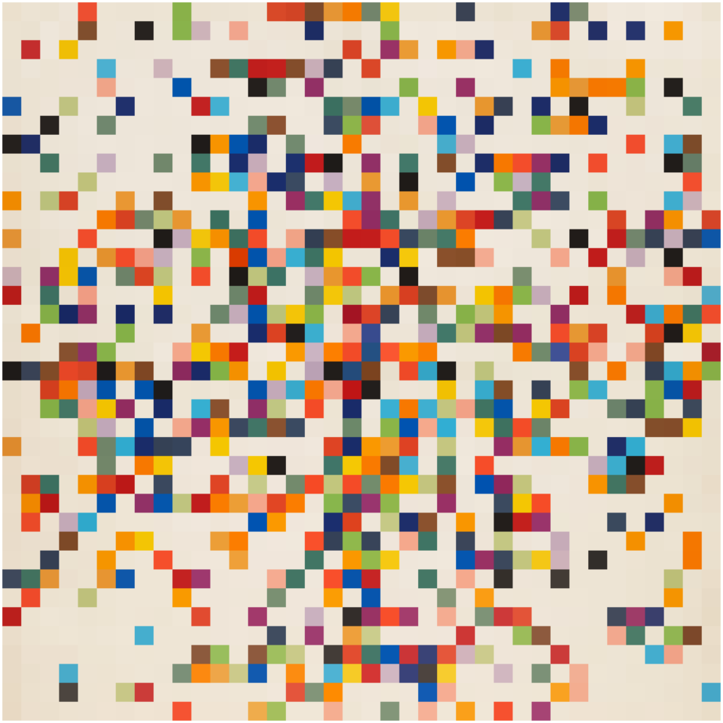
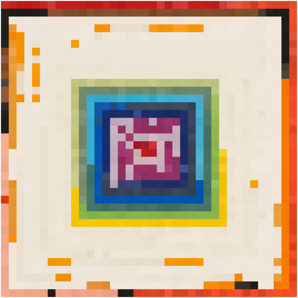
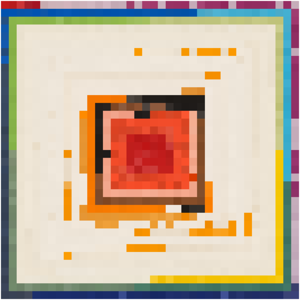
With this in mind: what to do about my project(s) using the original file? Well, nothing, just make a new series of the new version. My whole approach is in using all the variables and associations of the original works, including the source RGB/JPG files, to make new work often in series and variations. So this is a new work, using the same procedures / code as the previous one, on the new MOMA image:
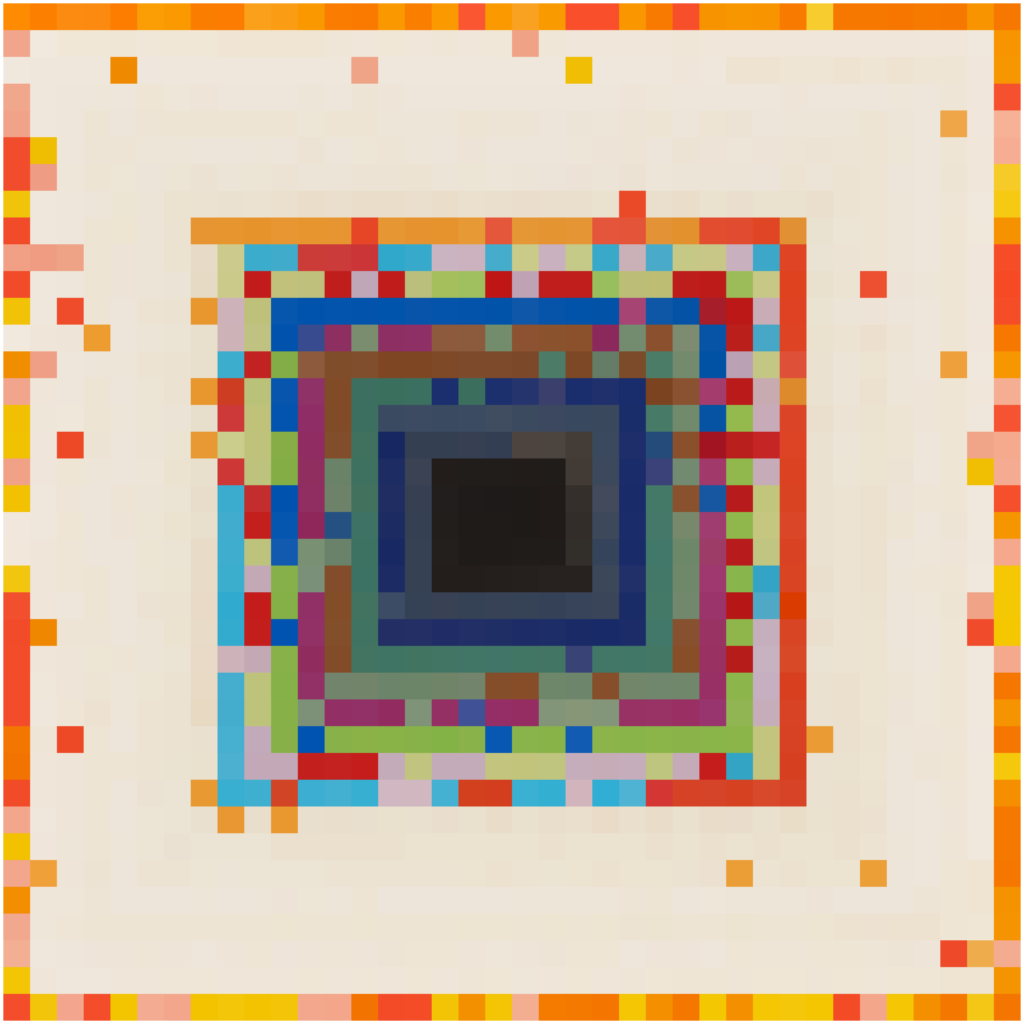
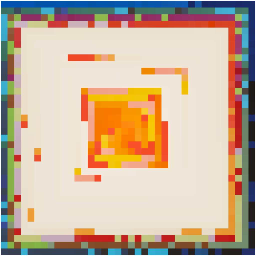
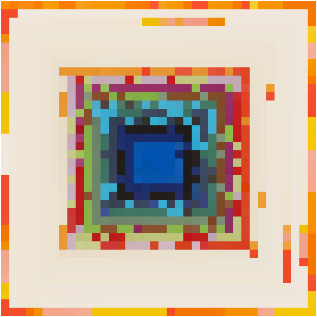
What I think is fascinating is how different the ordered images look! In the previous ones when I ordered by brightness the result was very predictable, even boring, now it is very… lively:
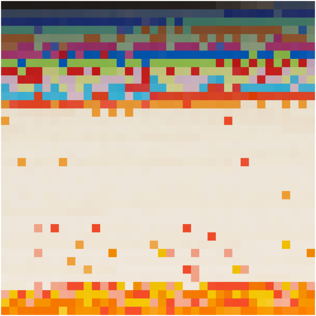
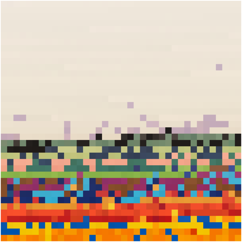
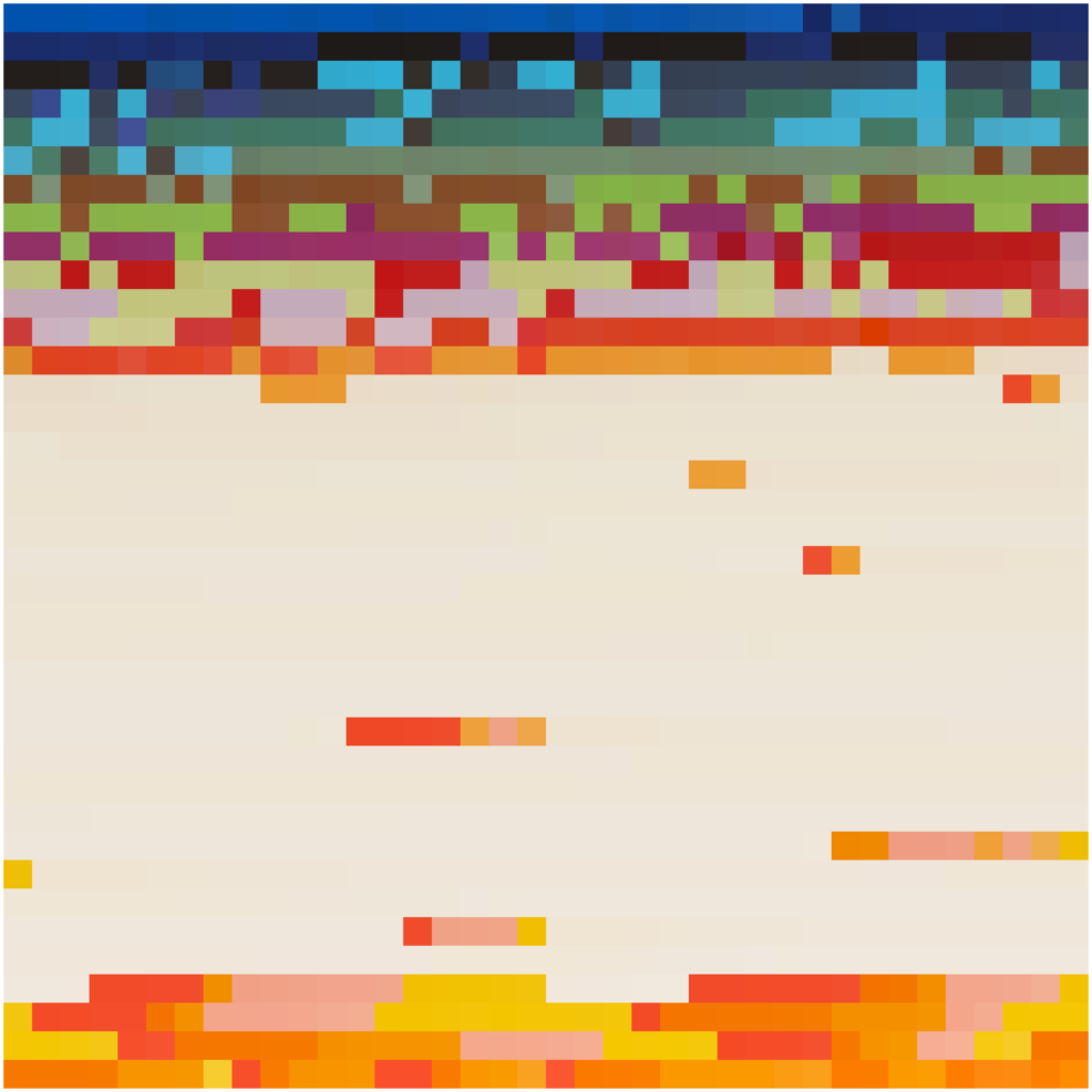
The same goes for the rest of these images, they are markedly more chaotic than the previous series:
These are also available as NFTs on OpenSea.