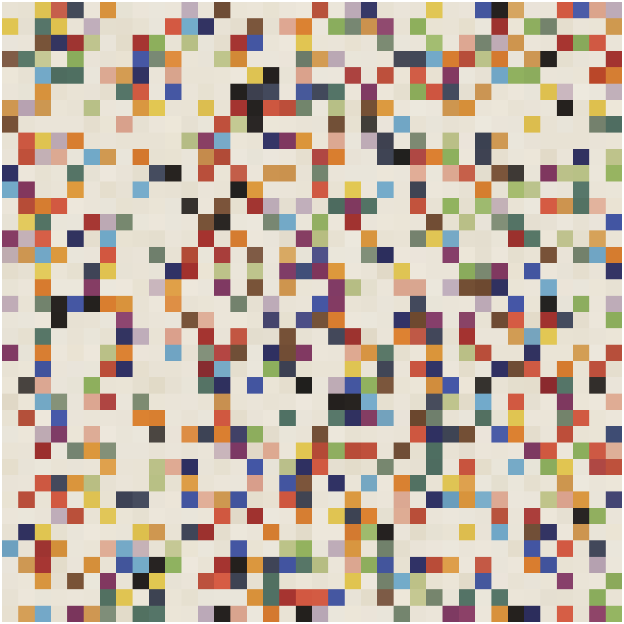
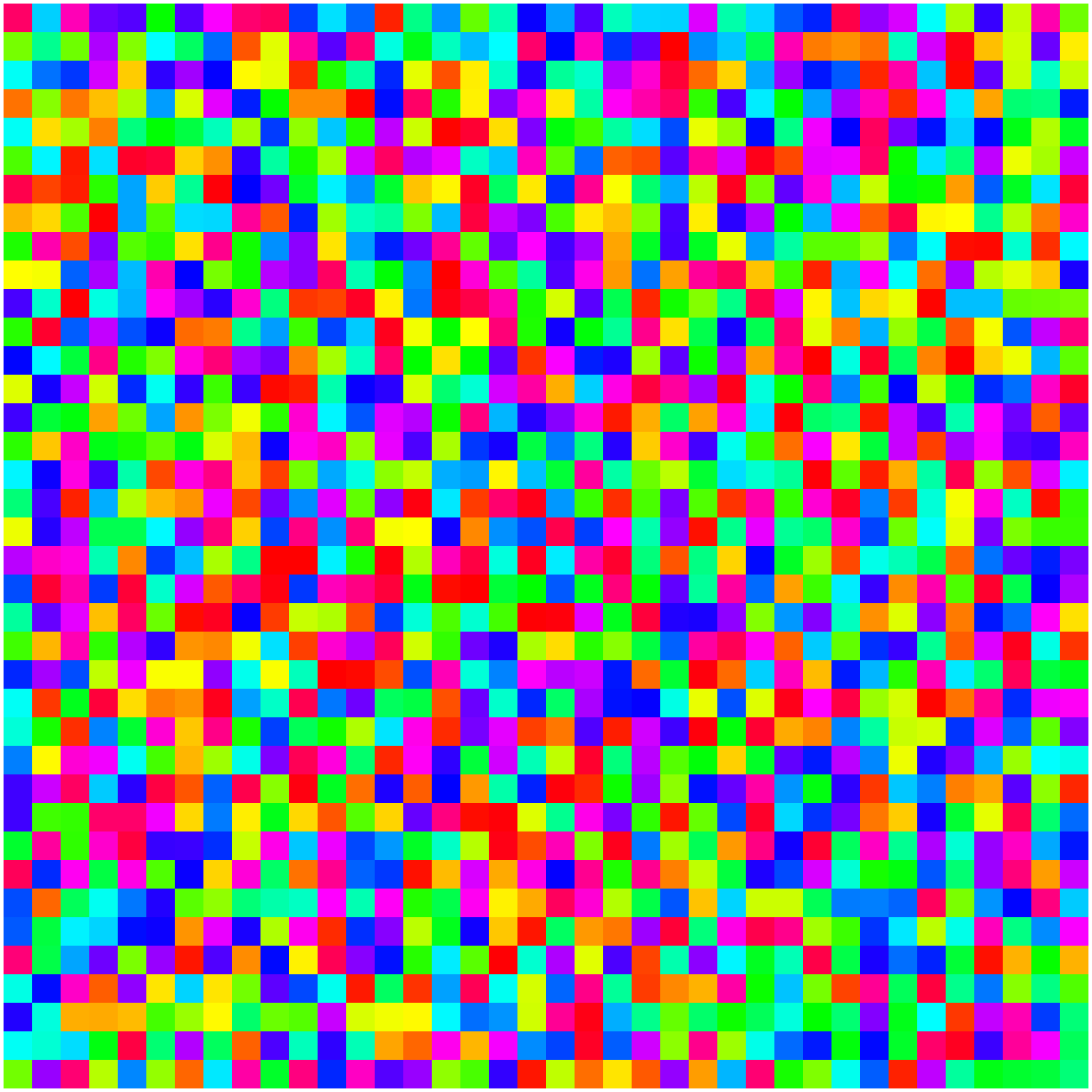
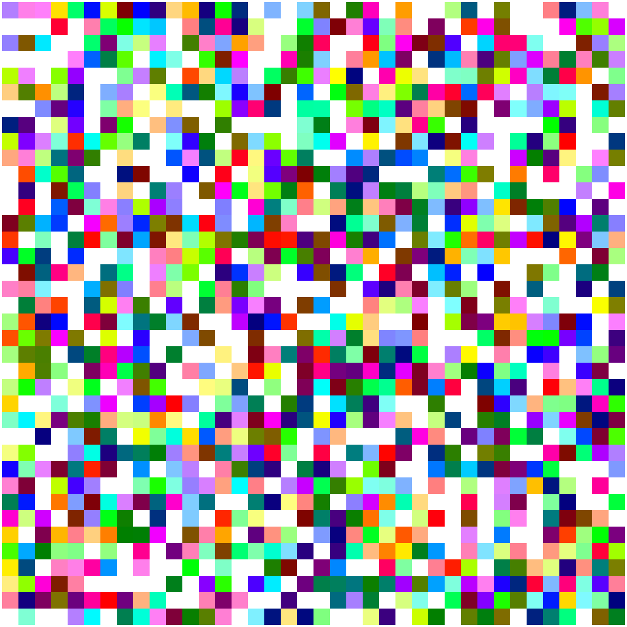
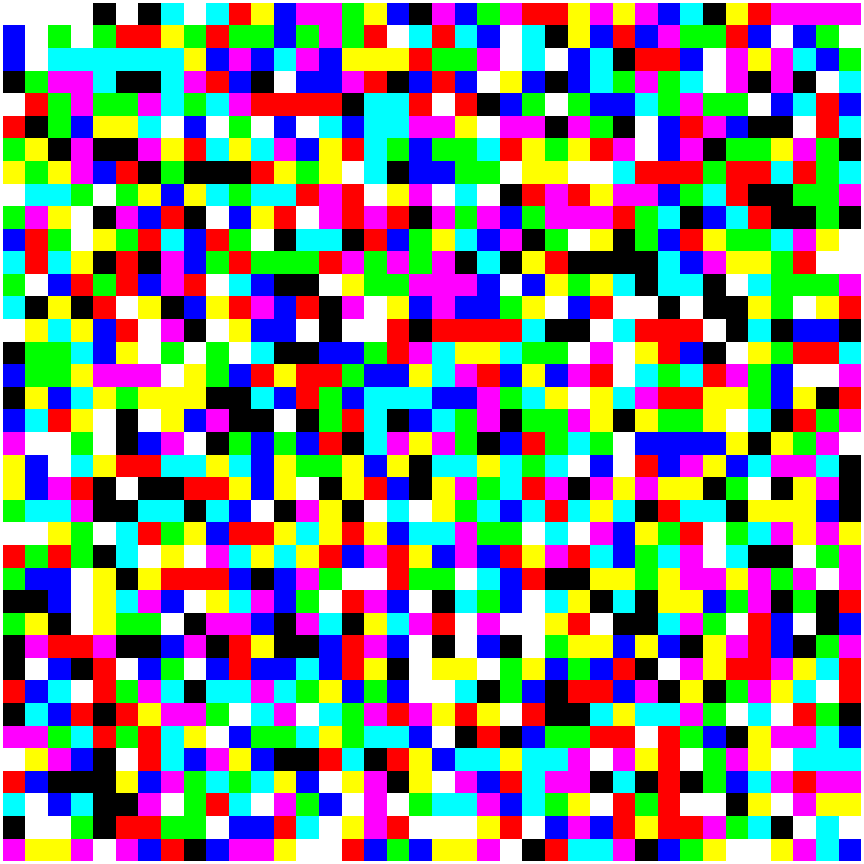
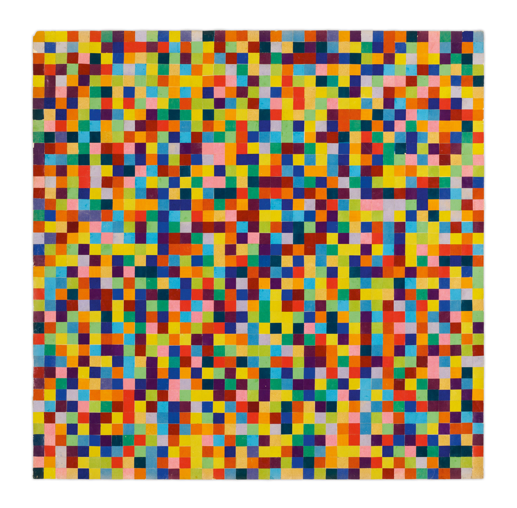
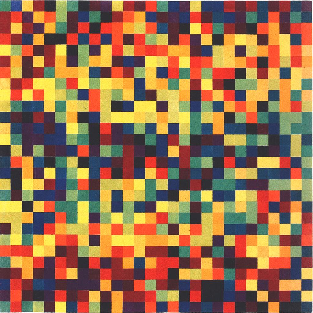
In computer generated art the RANDOM function is used a lot to add some unexpectedness and unpredictable visual interest. But artists have been experimenting with chance and unpredictability long before the computer. I have always loved the example of Ellsworth Kelly’s “Spectrum Colors Arranged by Chance II” in the MOMA collection. Somehow the colors have that 50s mid century feeling which I love.
I began wondering how Ellsworth Kelly had produced the work. And how it would look in a different configuration. Nowadays, with the random generator in the computer you could make 100s of variations. Kelly’s were done by hand.
In an interview Kelly said this about his process:
CHRISTOPH GRUNENBERG [CG]
http://www.tate.org.uk/tateetc/issue16/colourchart1.htm
In 1951 you did a number of paintings with random arrangements of bright colours. These works, in particular Colors for a Large Wall(1951), were a radical departure from your previous, mostly figurative paintings and from the collages experimenting with abstraction derived from observed phenomena of the visible world. Can you describe their genesis?
ELLSWORTH KELLY [EK]
In October 1951 I left Paris and went to the south of France. The summer before, observing how light fragmented on the surface of water, I painted Seine, made of black and white rectangles arranged by chance. I then started a series of eight collages titled Spectrum Colors Arranged by Chance I to VIII. Before this I had not used colour extensively. The collages employed different systems and arrangements, using chance to organise where a spectrum of eighteen colours would be placed.
[CG] Did you use a mathematical system with the early works?
[EK] It was a chance system for the placement of colours on a grid. Numbered slips of paper each referred to a colour, one of eighteen different hues to be placed on a grid 40 inches by 40 inches. Each of the eight collages used a different process.
[CG] Did you make conscious references in the arrangement of these works to the aesthetics of the colour chart?
[EK] I never thought of colour charts at all when I was working on them. They were really an experiment. I wanted to show how any colour goes with any other colour. Above all, I wanted to learn about colour relationships. Many of the works of this period start from chance encounters, such as shadows on a staircase, the reflections of the sun on the River Seine and the exposed sides of buildings that showed the abstract black patterns where the chimneys had been. After the experiments with arranging colours by chance came my first works using the actual colour spectrum as a source (Spectrum I, 1953).
[CG] Did finding those coloured papers in Paris help you to reach abstraction?
[EK] I used them as an indication for the hue, as a guide only. When I painted I always mixed the colours that I wanted; all were bright and at their full intensity.
[CG] Was there something about the light, the atmosphere and intensity of colour that was reflected in those compositions made in Paris and in the south of France?
[EK] While working in Paris after the war everything was grey and, as I’ve said, I used very little colour. When I finally went to Sanary, I did Colors for a Large Wall. It was the first work I painted in the south of France.
[CG] How did you come to execute Colors for a Large Wall in separate panels?
[EK] Having done the collages and worked with the individual colour squares helped me to see that I could use a different canvas on its own stretcher for each of the 64 panels that make up Colors for a Large Wall. Each would have only one colour. This dispensed with the problem of composition, of internal divisions of the canvas. The division was a given of the material support, not something drawn on it.
[CG] Was this transcending of the canvas the beginning of the idea of the mural, which you were very interested in at the time?
[EK] In the 1960s the Minimalists’ work was considered to be more or less what it is. The painting or sculpture represents itself. I feel that ten years earlier, starting in 1950, I was struggling with exactly the same problem. Colors for a Large Wallconstructed of 64 separate panels becomes a “painting object” that separates the form – the painting – and the ground, which becomes the wall. The edge of one panel next to another panel is not the same as one colour painted next to another colour on a single canvas. When I want to do a painting with one colour overlapping another, it has to be a real overlap, not a depicted overlap. I didn’t want to paint an overlap, meaning that it would be a deception or illusion. I no longer wanted to depict space, but to make a work that existed in literal space. Thus, my recent works are one canvas as a relief over another canvas. Another important example of a panel painting that explores the idea of the mural was Red Yellow Blue White (1952). It’s the only one I ever did using actual dyed fabric of ready-made colours, which moves the painting into the realm of real objects. It consists of five vertical panels, each with five canvases. The vertical panels are separated on the wall and the intervals of the wall surface between them are part of the painting.
[CG] Do you think the relief paintings, such as Méditerranée(1952), are coming more out of the early relief works, or out of the multi-panel ones such as Colors for a Large Wall?
[EK] Both. Relief work figures predominantly during my time in Paris. After Méditerranée, the pictures were mainly paintings in multiple panels.
[CG] How did your use of colour differ between France and the United States?
[EK] In Europe at the beginning of the twentieth century, the Fauves – Matisse,Derain – were using bright colours in their full intensity, which continued with Kandinsky, Malevich, Kirchner, Léger and Mondrian. They employed all the colours of the spectrum. In the 1940s and 1950s the majority of the Abstract Expressionists in New York rebelled against this European use of colour and mostly used mixed colours. That is, the Abstract Expressionists did use bright colours sometimes, but they tended to paint wet-on-wet, which muddled their hues. As Matisse would say, a small patch of any one colour is far less intense than a large one of the same colour. I returned in 1954 to New York and showed paintings done in France at the Betty Parsons Gallery in 1956 with bright colours that wouldn’t really be used until the Pop artists in the 1960s. My idea of using colour at its full intensity, which began with Colors for a Large Wall, hasn’t changed in the 60 years that I’ve been painting.
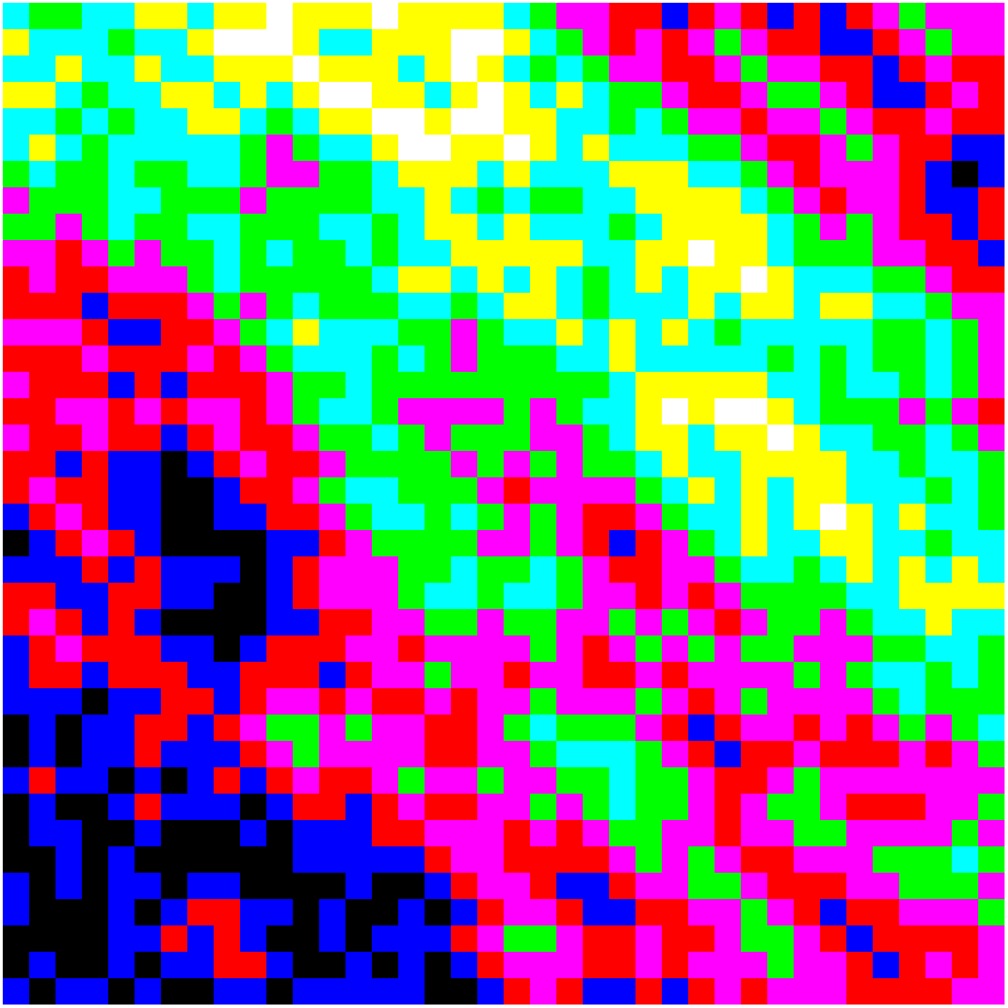
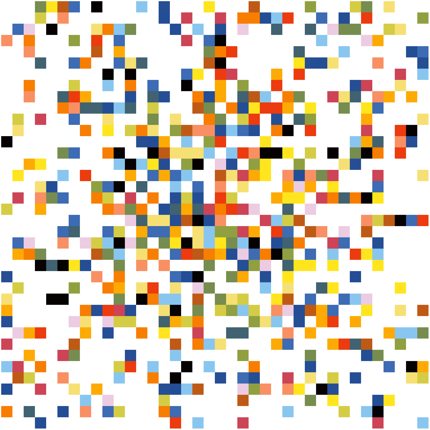
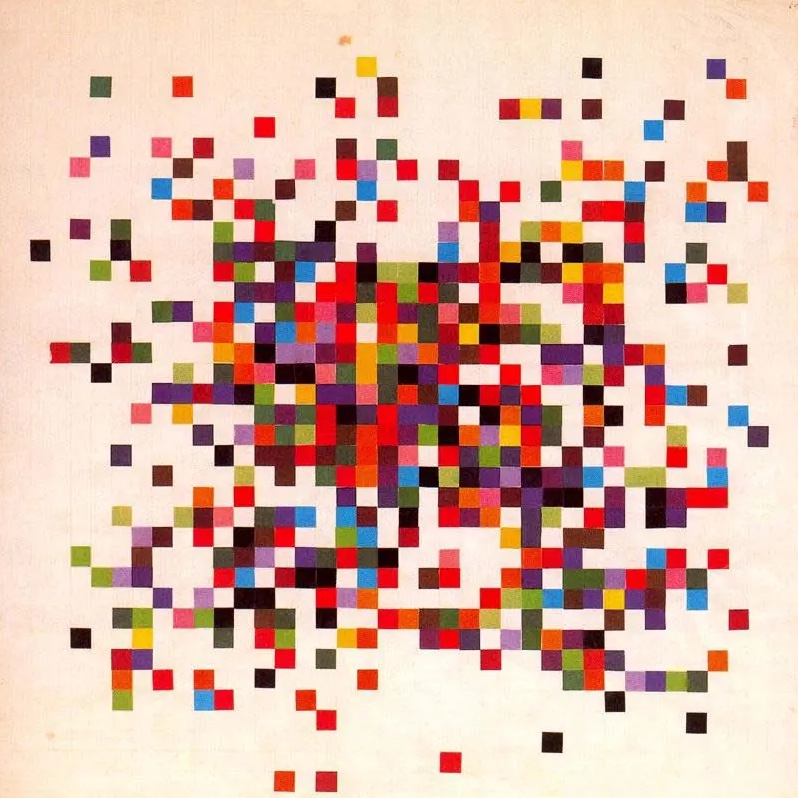
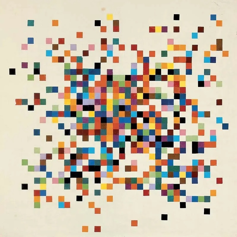
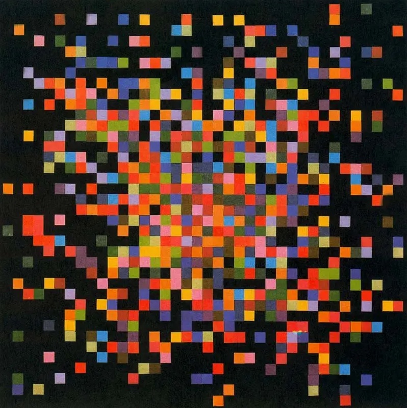
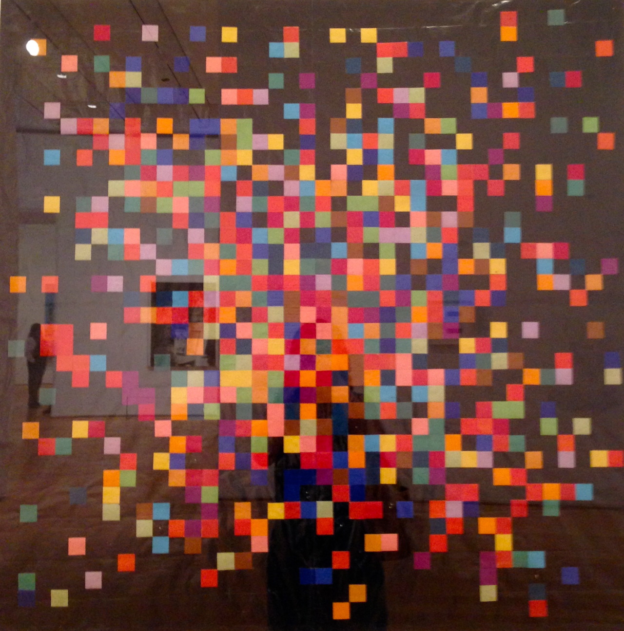
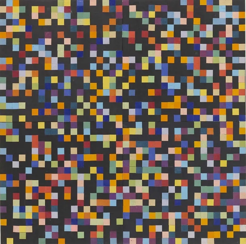
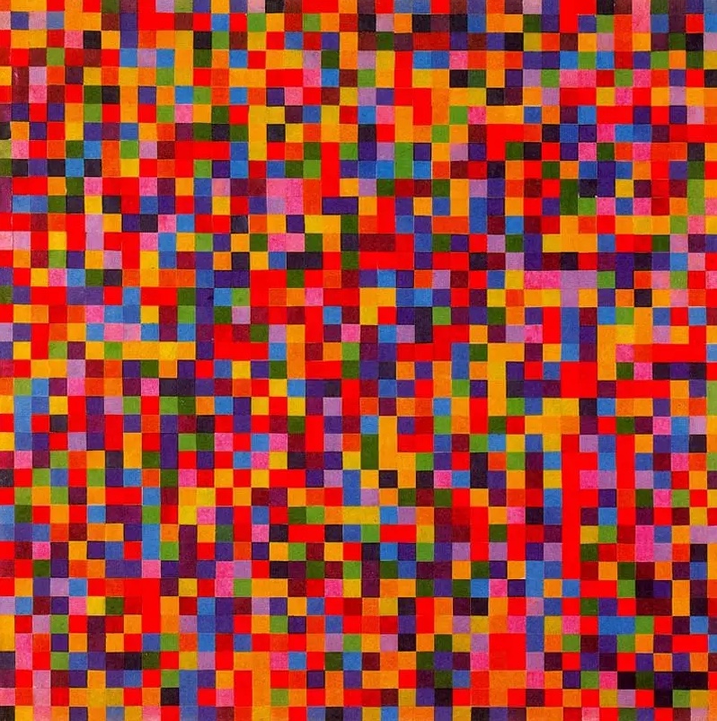
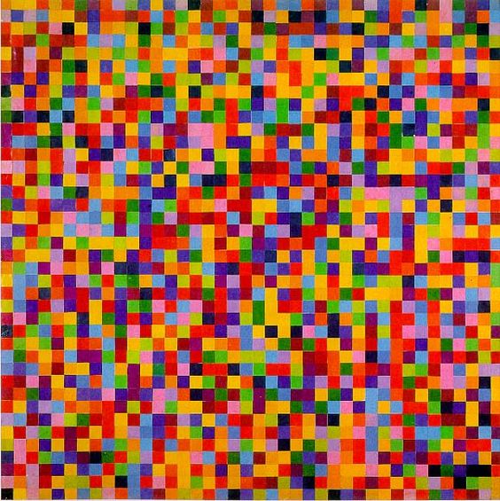
I did not know this when I created my first series of the computer generated “Spectrum colors arranged by chance”. I simply took the colors from the image from MOMA, and rearranged them randomly a 1000 ways, and selected 10 that I found most pleasing or interesting.
And just like Kelly experimented with different ranges and processes and finally arrived at the actual spectrum colors as a source for his images, I took his idea and general format to create and generate my own series of Spectrum colors arranged by chance. Working in my own references and fascinations.
You can see all my works in this series here or on the collection page on OpenSea, the NFT market place.
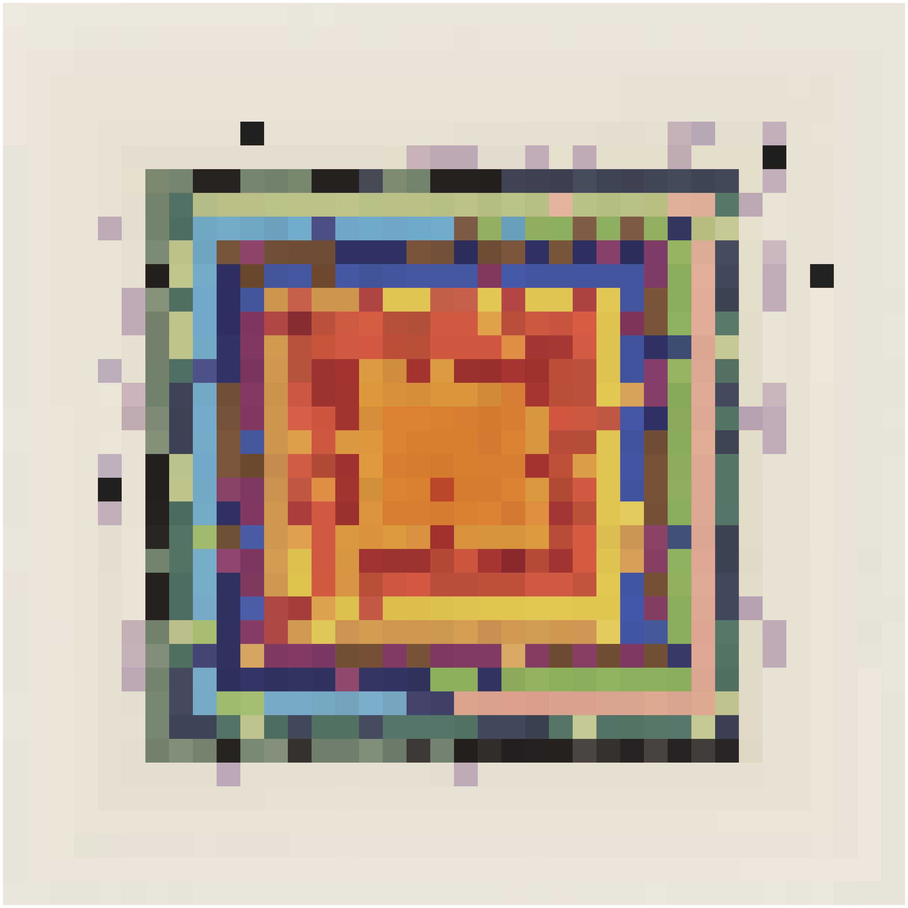
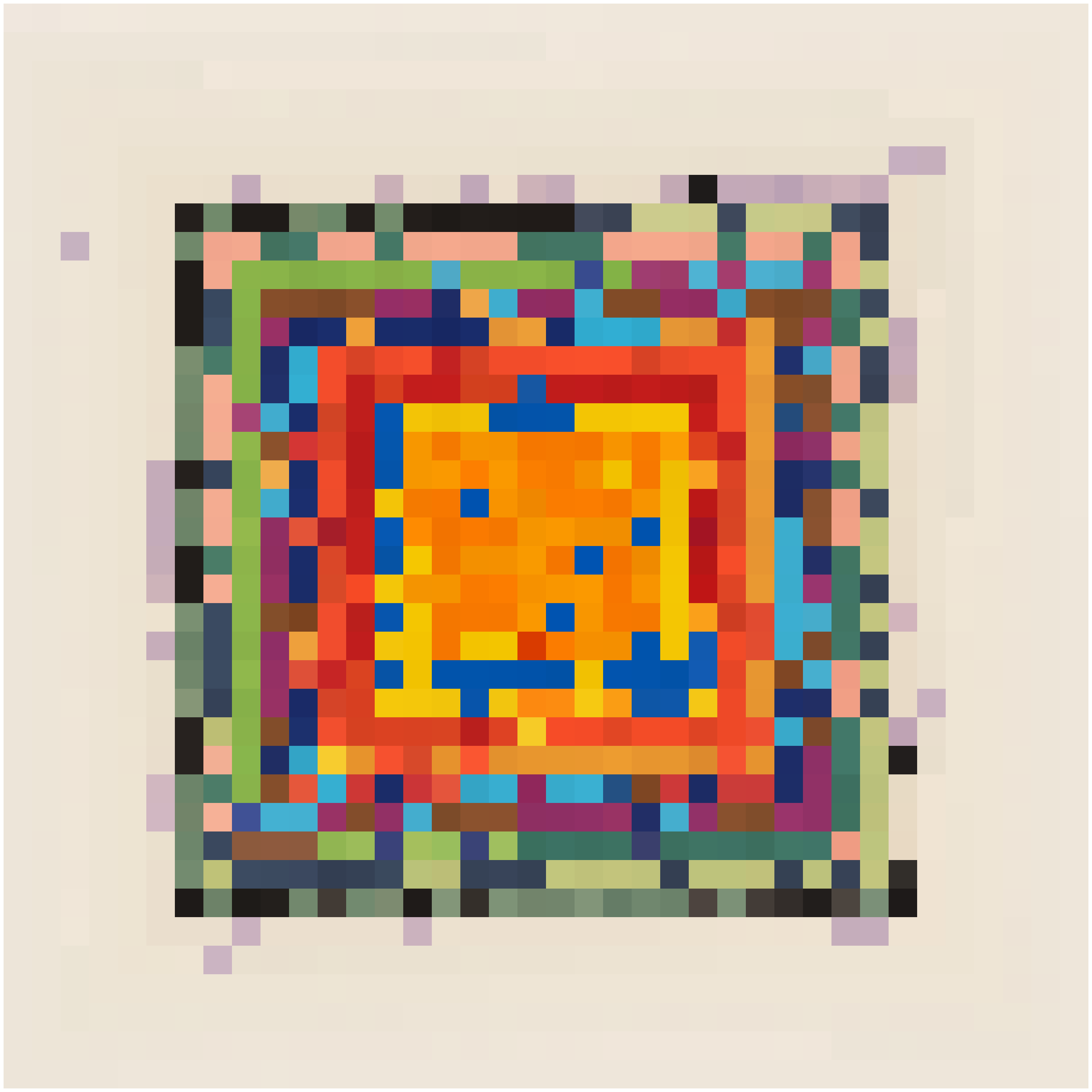
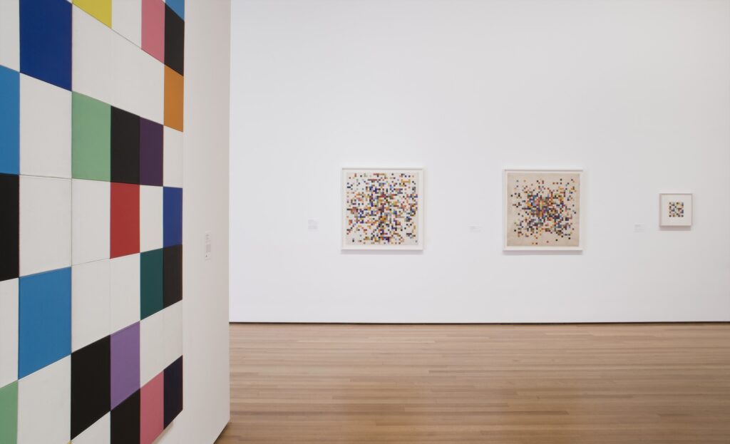
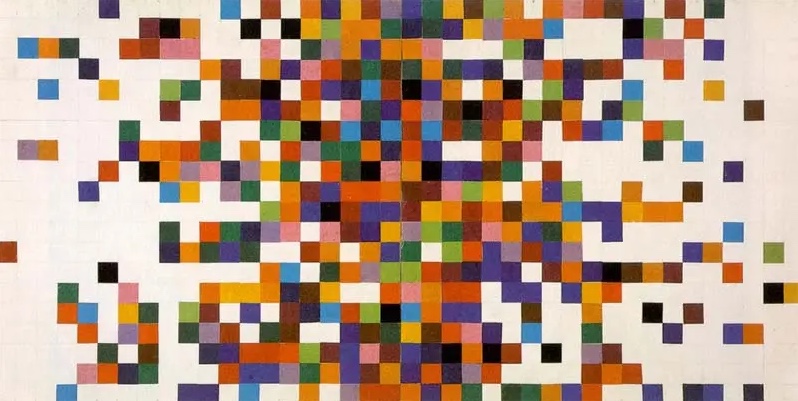
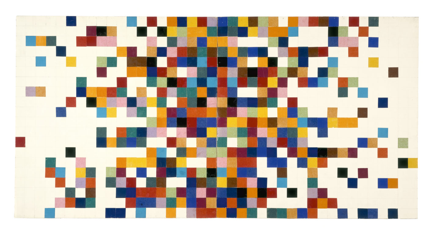
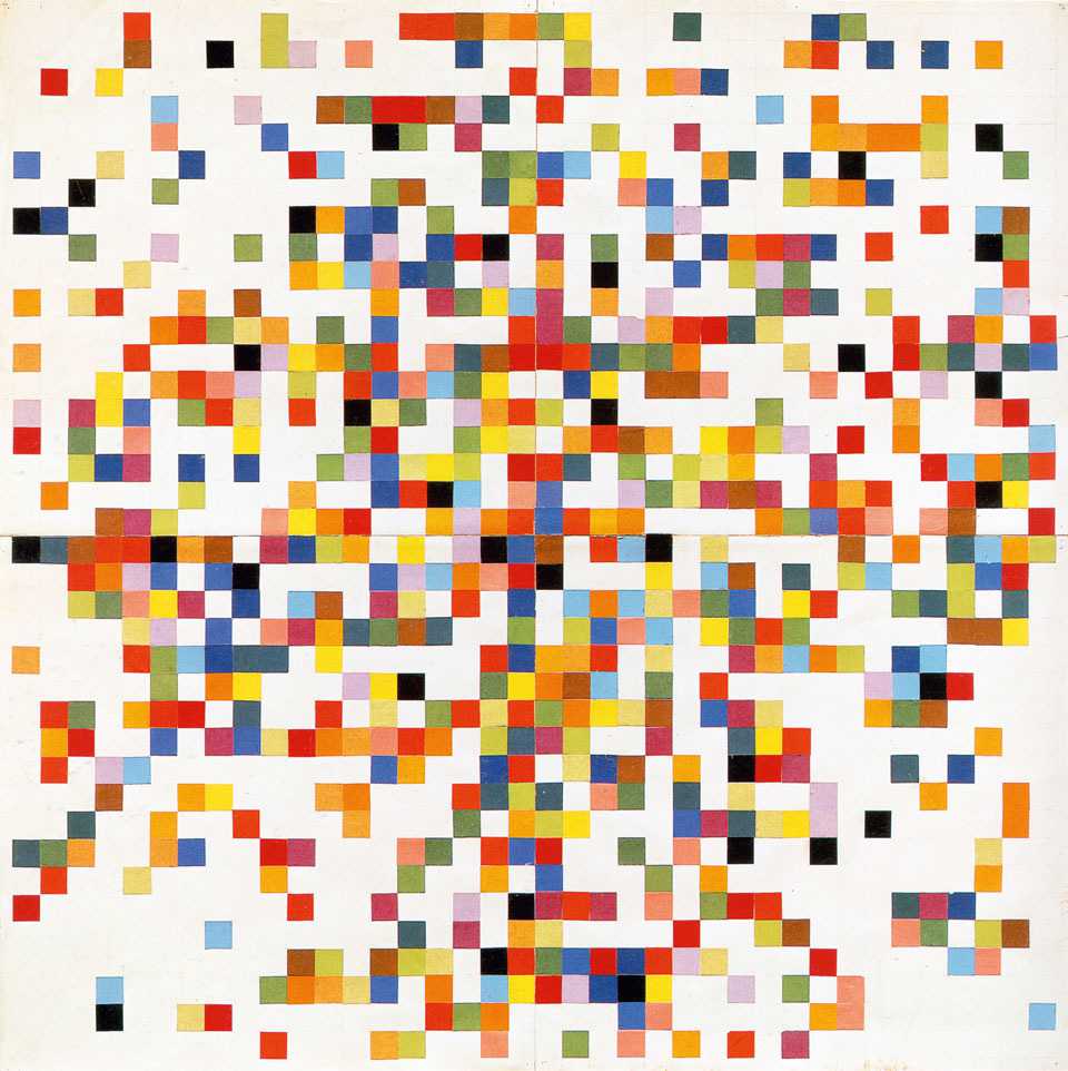
Below are the 8 original collages by Kelly. For some of these I have included all the different photographs I could find, to remind myself on how relative color is. I would love to see the original nr II in the MOMA some time!

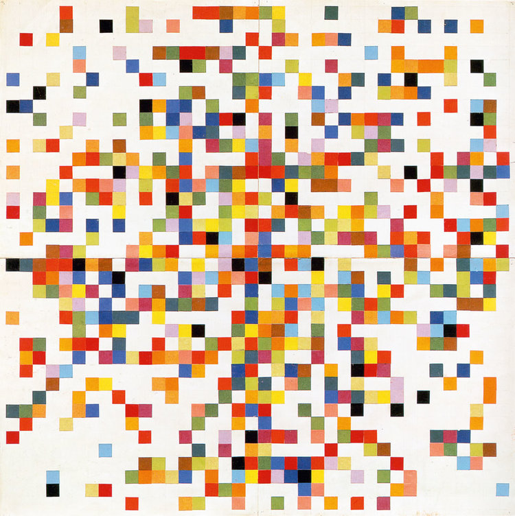
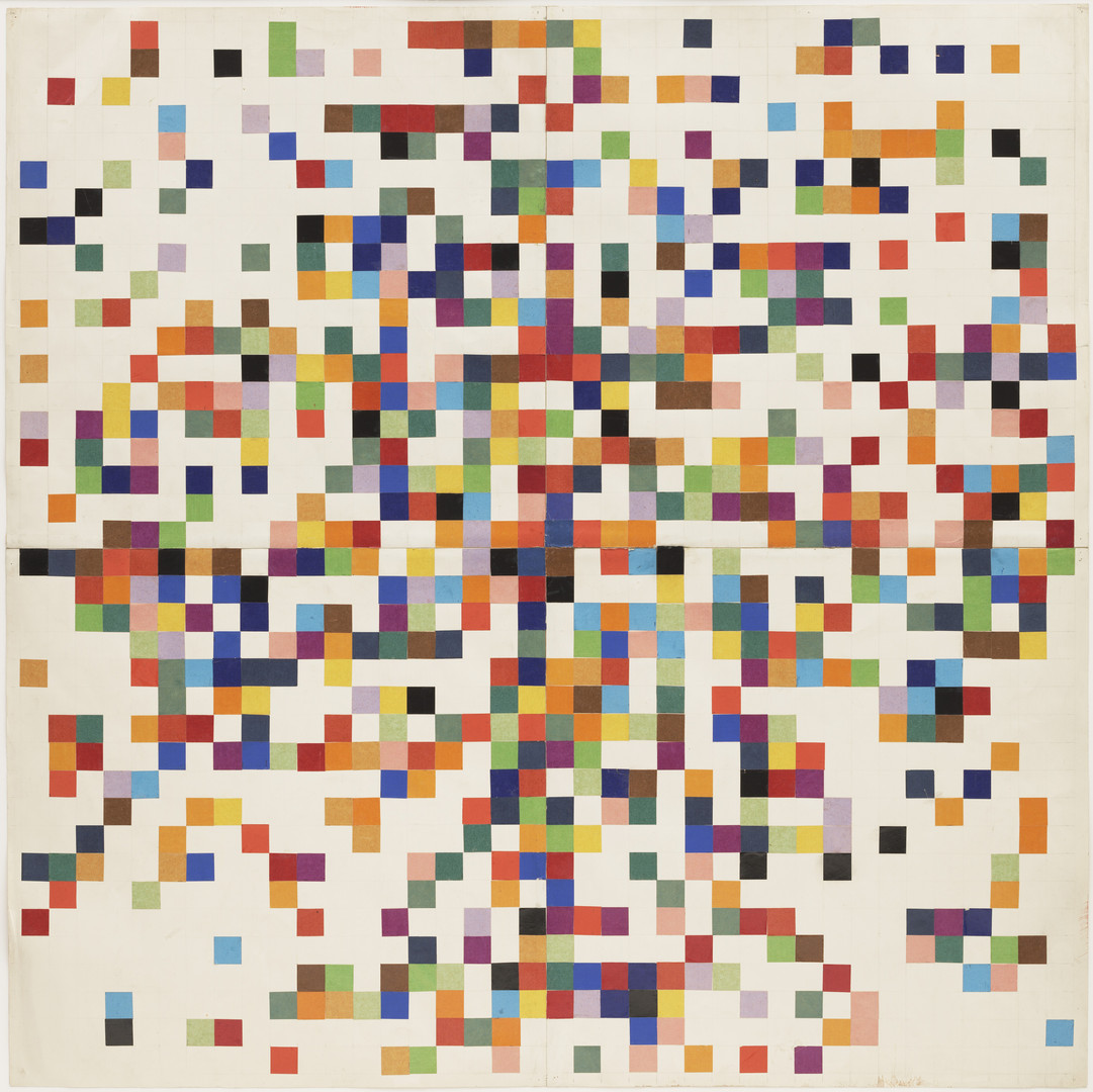
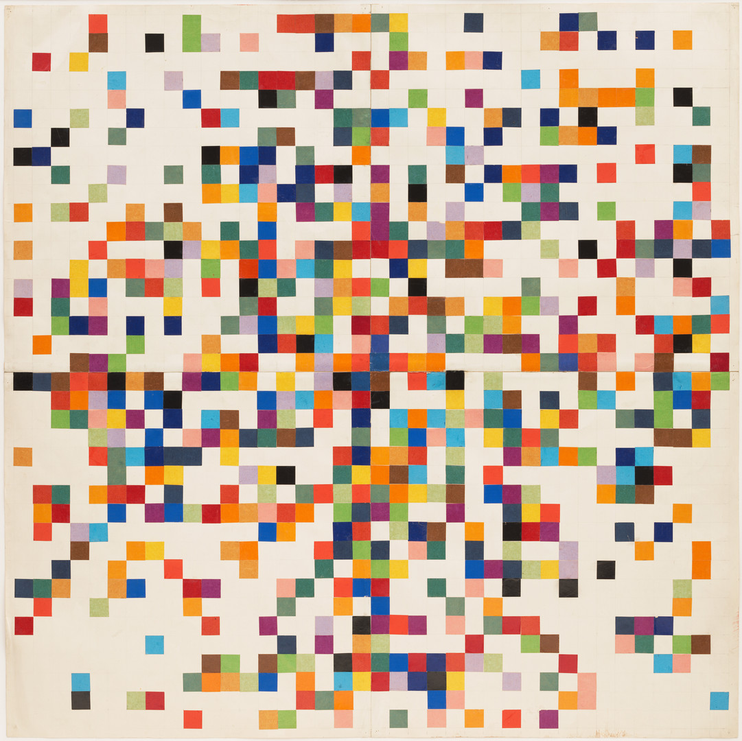


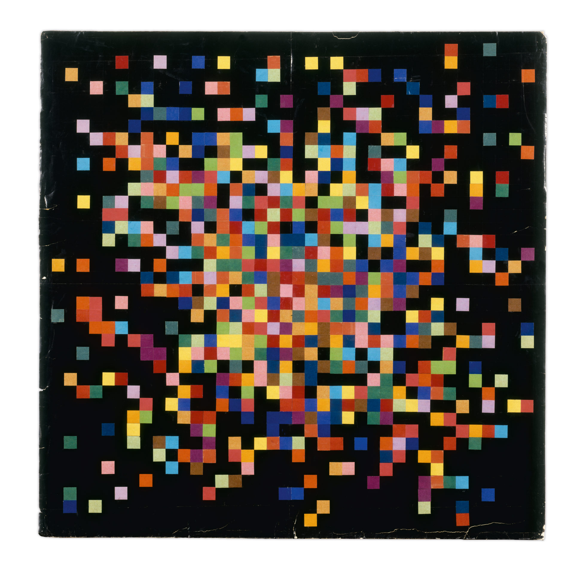
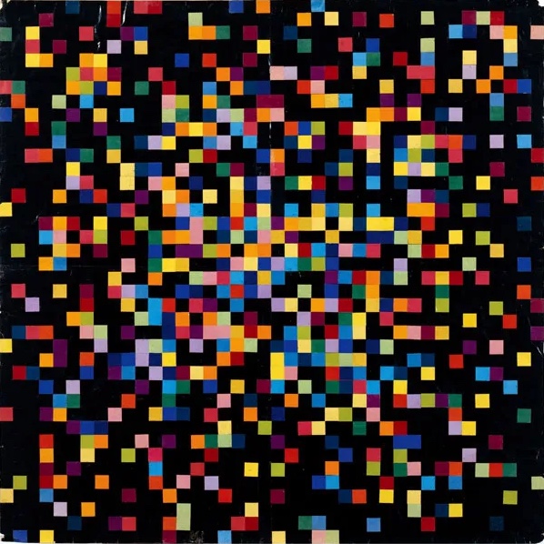
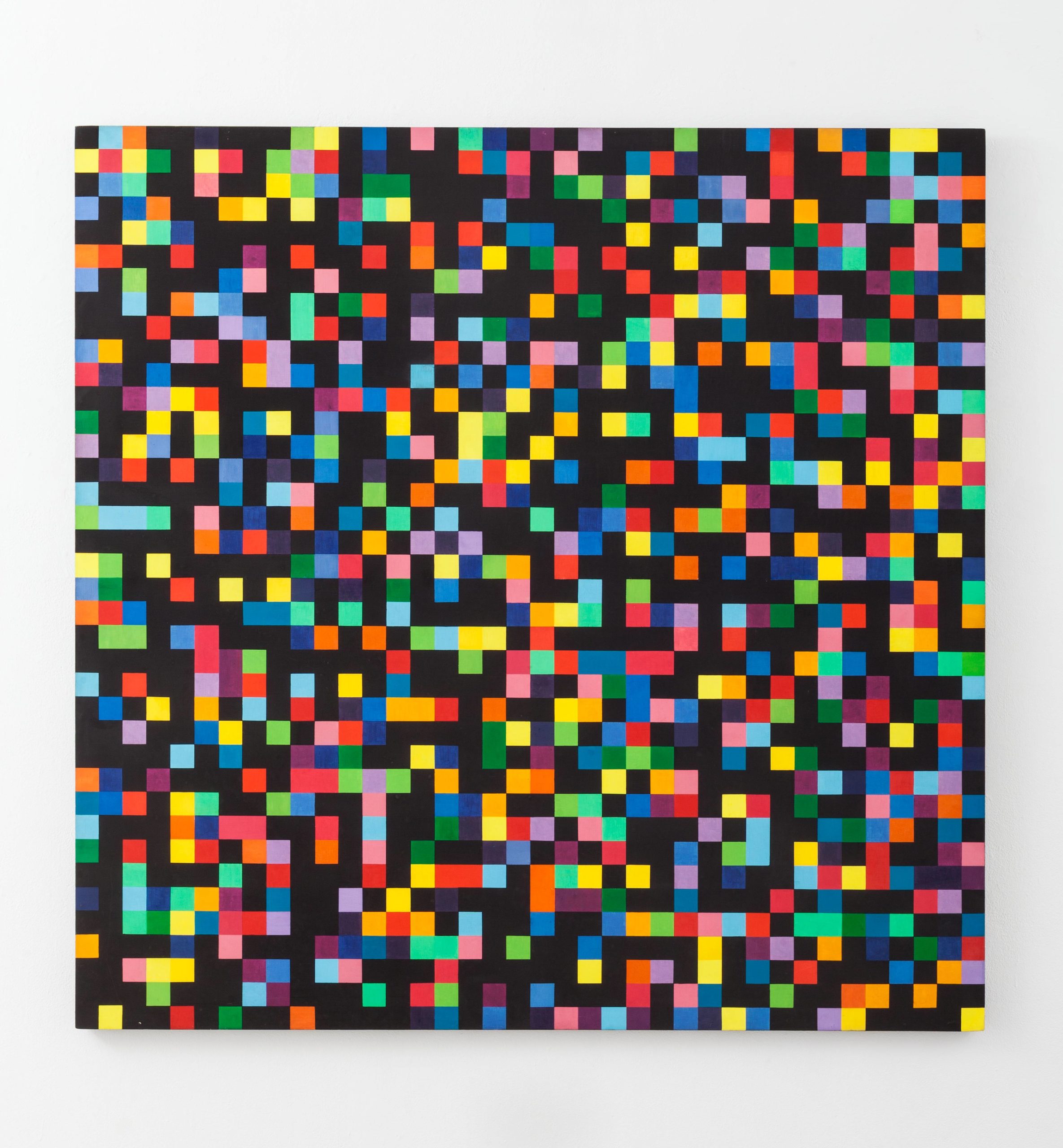


Somehow there is NO image to be found of nr VIII. There was a catalogue raisonee published in 2021, I might try and track that down and hope there is a picture of nr VIII in there. Until that time here is Ellsworth Kelly’s “Spectrum Colors Arranged by Chance I to VII”
[update]
I went to the Stedelijk Museum library where they have the catalogue raisonee, and I spent an afternoon there browsing through it and reading thoroughly the entry on these 8 collages.
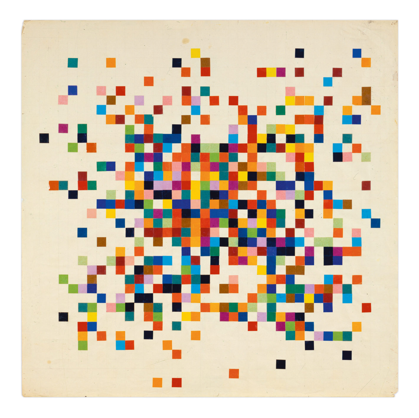
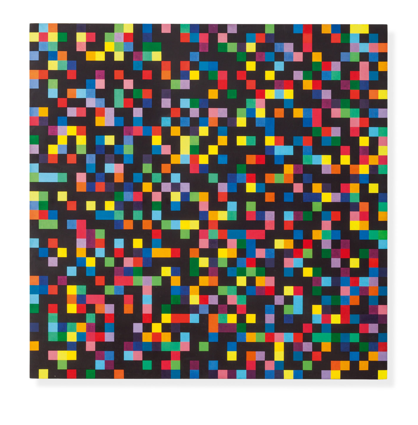
I received a scan of the page with nr VIII on it from the very kind clerk at the library. However the colors are hard to get right, as you can see from the collection of the others above.
This last one is slightly larger than the others and has slightly larger squares.
The catalogue contained a lot of fascinating and illuminating information on Kelly’s process and thinking and way of working. These have given me new ideas to create new variations in this series. Unfortunately the brand and exact color range of the papers Kelly used was not specified. I was curious if they would maybe still exist as a brand / manufacturer? The only reference in the text was that it was sold as “’papier gomette’ in 20 or so commercially available colors, including non spectral colors like pink or brown”. I was kind of disappointed that there was no cataloguing / index which colors were used in which collage.
There was some indication given as to how Kelly approached the randomization, and the rules he set per collage, but not definitively and extensively. Selecting random colors was ‘pulling numbers from a hat’. But he did set boundaries and rules: for example he decided to use about 40 squares of each color, only the position was random, and there were not to be two of the same color next to each other (a principle that he has abandoned for several of the collages). He also alternated between working in rows, where for example every next row would have one extra white square. And it was stated that “the various systems of colour distribution are based on the fact that if one begins with a square nucleus made of four juxtaposed square units, every concentric ring of units around it will consist of only 8 more squares than the preceding ring” but there was no elaboration on what this would mean or how this would work.
I inspired to keep making different series based on different rules and colors myself. And I even felt encouraged when I the text hinted at whet Kelly was looking for making these collages:
The artist was missing something [in Spectrum Colors Arranged by chance I] that had so appealed to him in Seine: in this work, the system presiding over his formation was absolutely transparent despite its complexity. There was not a whiff of secret studio tricks; one could easily reconstruct the process and thus () imagine oneself reproducing it.
I like to imagine he would be quite please that the computer was taking a large part of the work, and that he would quite like the resulting graphics, and maybe even the seemingly endless variation and multitude of images.